Vango: Filtering
A marketplace connecting artists to art buyers with original, one-of-a-kind works.
Problem:
Our users were frequently requesting the ability to filter our collections of art in order to find a piece with a specific size or orientation that would fit their space.
Research:
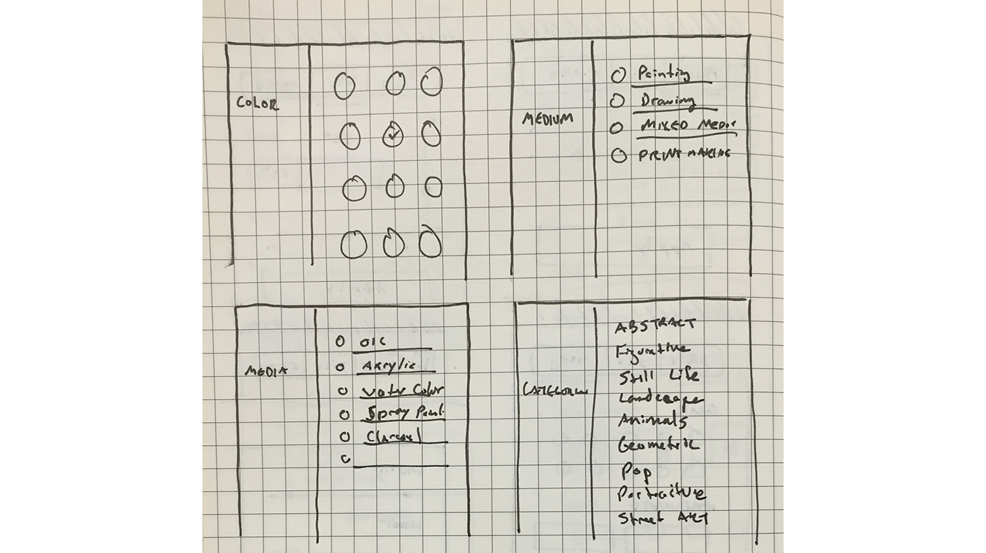
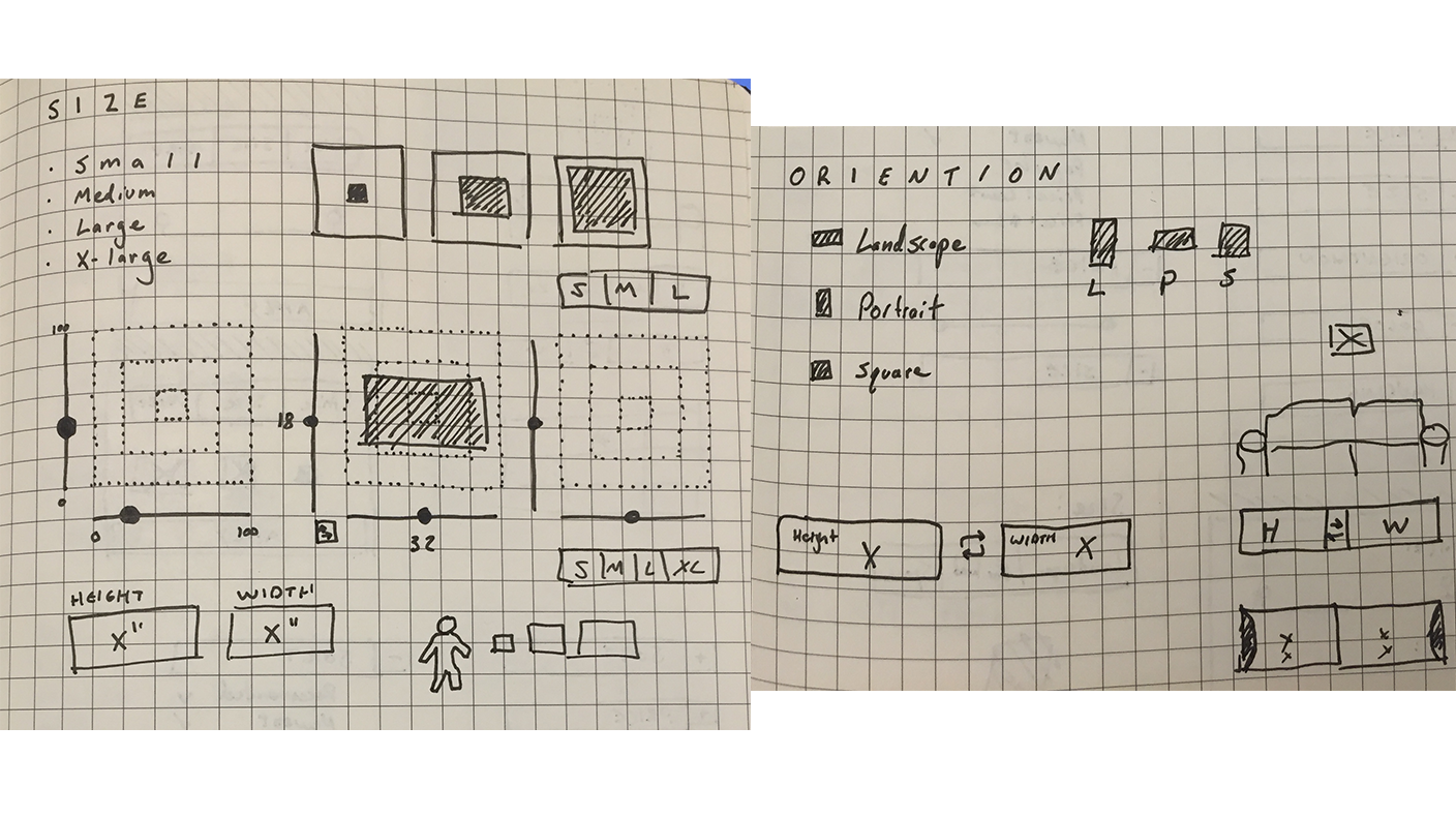
During the redesign process of the collection views I completed several card sorting exercises and usability tests with several prototypes of the collection grid views. The properties that were most frequently identified for filtering were price, size, orientation and color. As an e-commerce platform, I also researched industry best practices and surveyed other e-commerce apps.
Solution:
1. Sketching
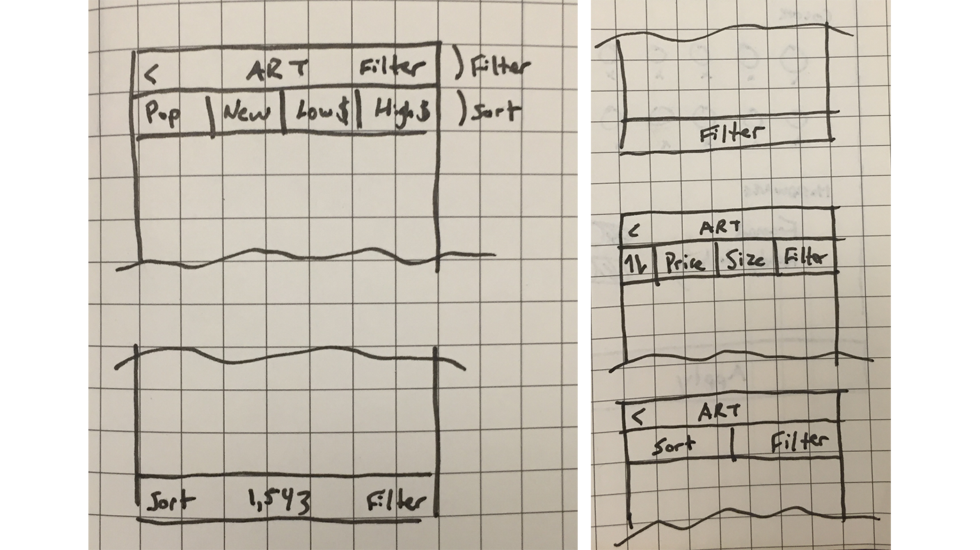
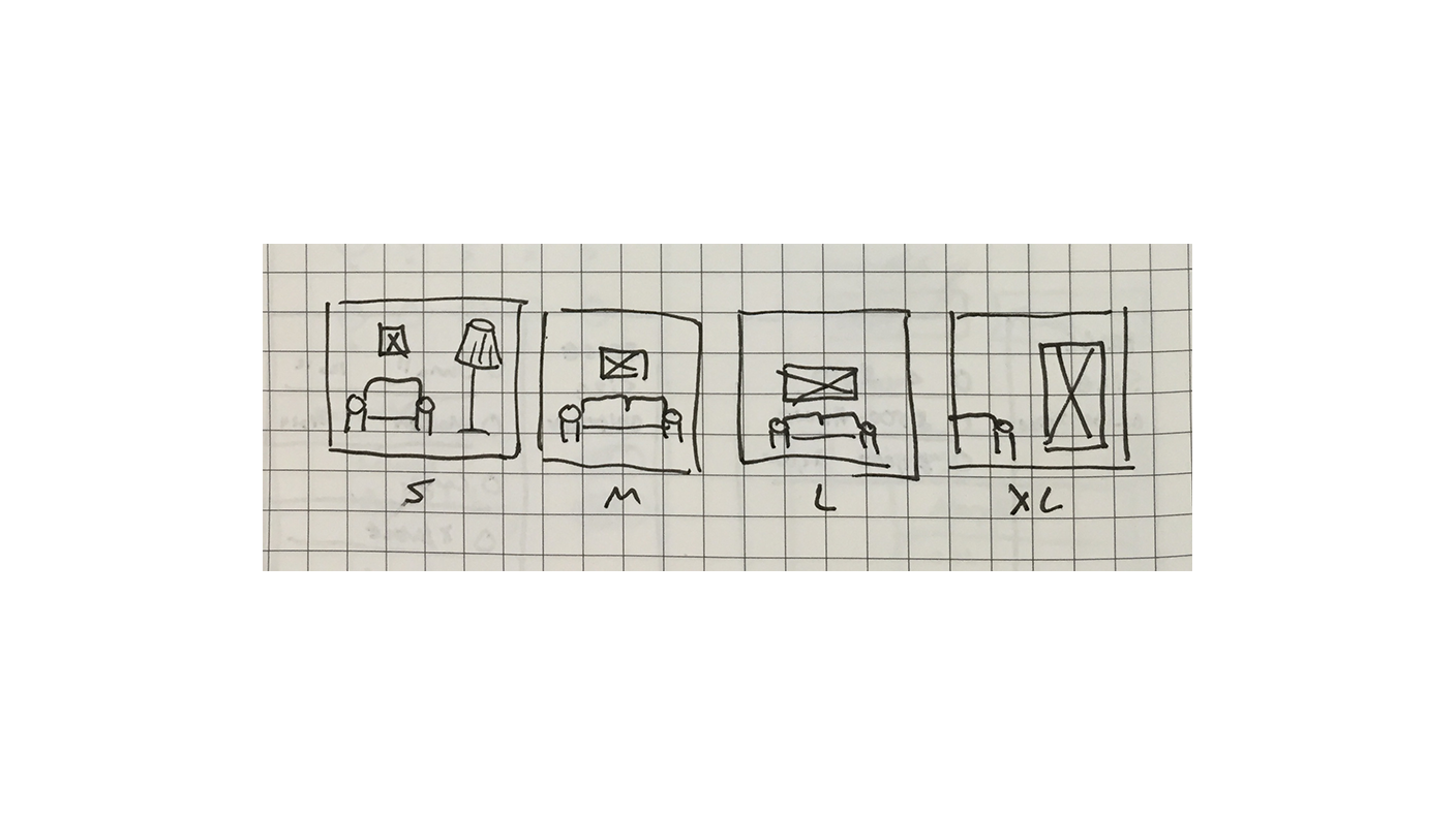
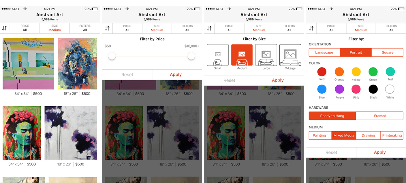
In a one week sprint, I started quickly on paper sketching out potential solutions for where the filters should be presented along with the best UI elements for each of the filter properties.
2. Mockups
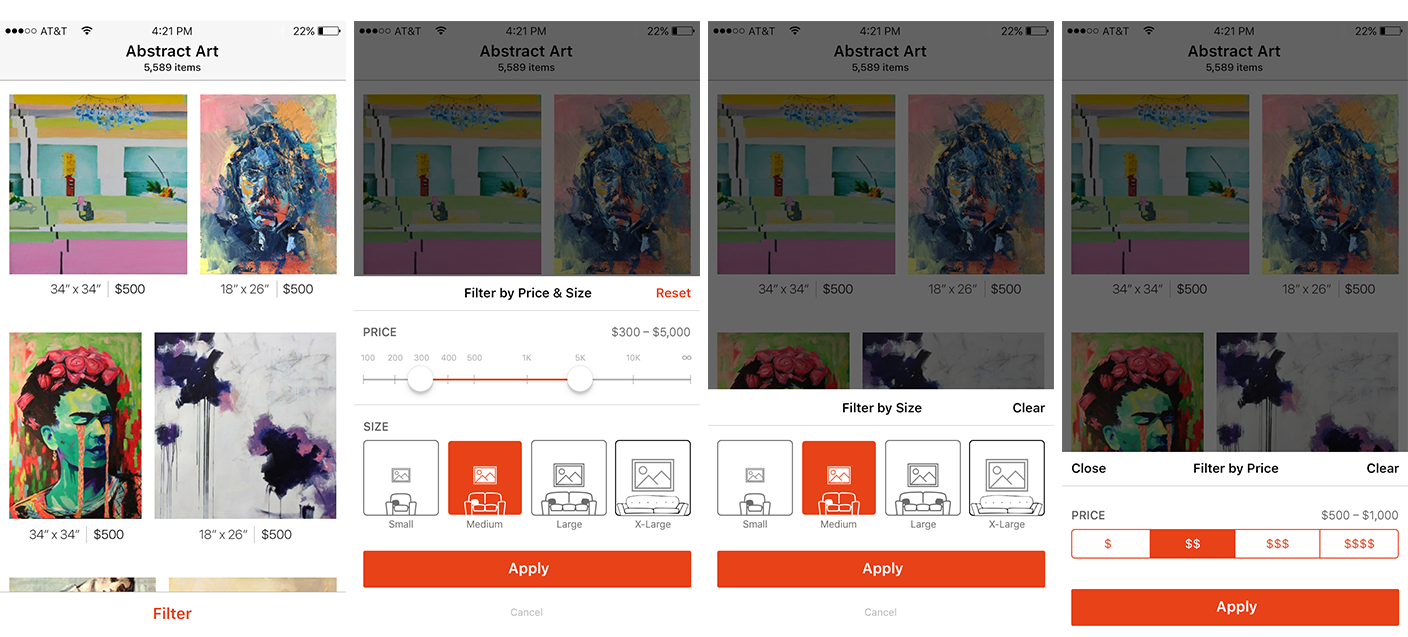
Working with the rest of the product team we selected which sketches could be good solutions and decided to see them in higher fidelity. While analyzing the various solutions, we evaluated showing the filter controls on top of the grid view versus at the bottom of the grid view. With the top version, I explored giving the most requested filter options a dedicated button with exposing what filters were being applied to the product grid view. With the bottom filter version, I explored keeping the filters in close reach of the user's thumb.
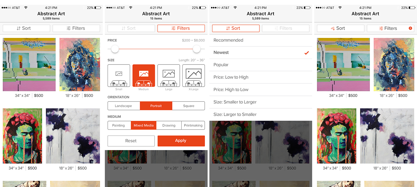
3. Final Result
We decided the filters worked best from the top, closer to the collection name and the reflected item count. The filter options that weren't supported by the current API would be removed and slated for later. We also decided to simplify the sort and filter button row to just two items. Here is the final design for the filtering feature:

